“How might we make the CPK app invite the user to explore
and discover CPK's offerings?”
UX RESEARCH - UX DESIGN - UI DESIGN - USABILITY TESTING
OVERVIEW
PROJECT BACKGROUND
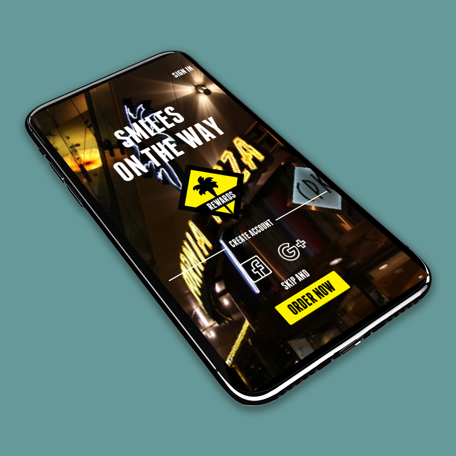
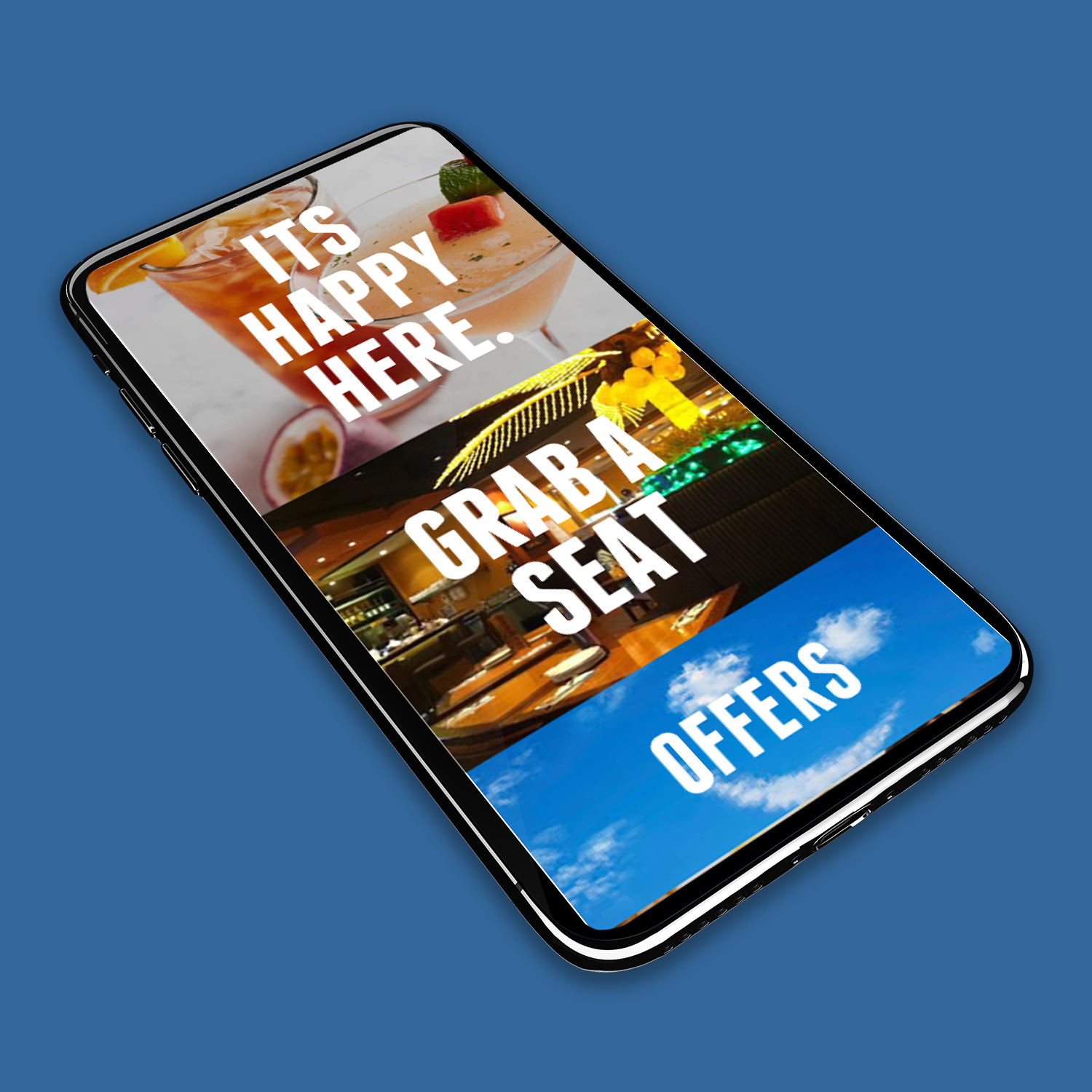
PRODUCT Re-DESIGN
CPK believes they give California a place in the "pizza pantheon" alongside Chicago and New York. This may be true but in 2018 their app was needing major improvements.
CONTEXT
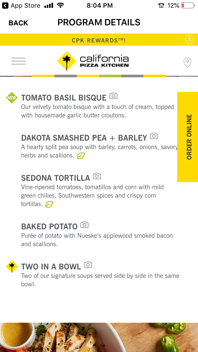
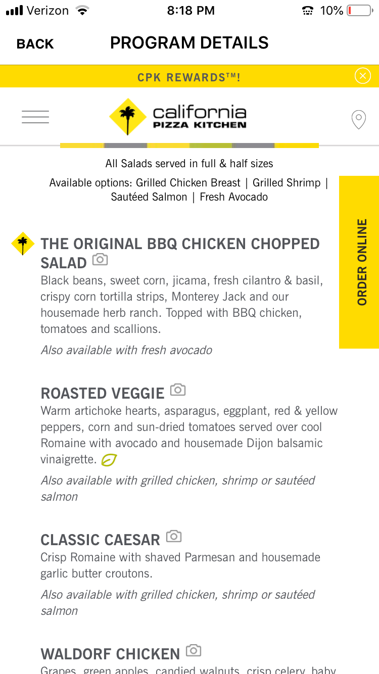
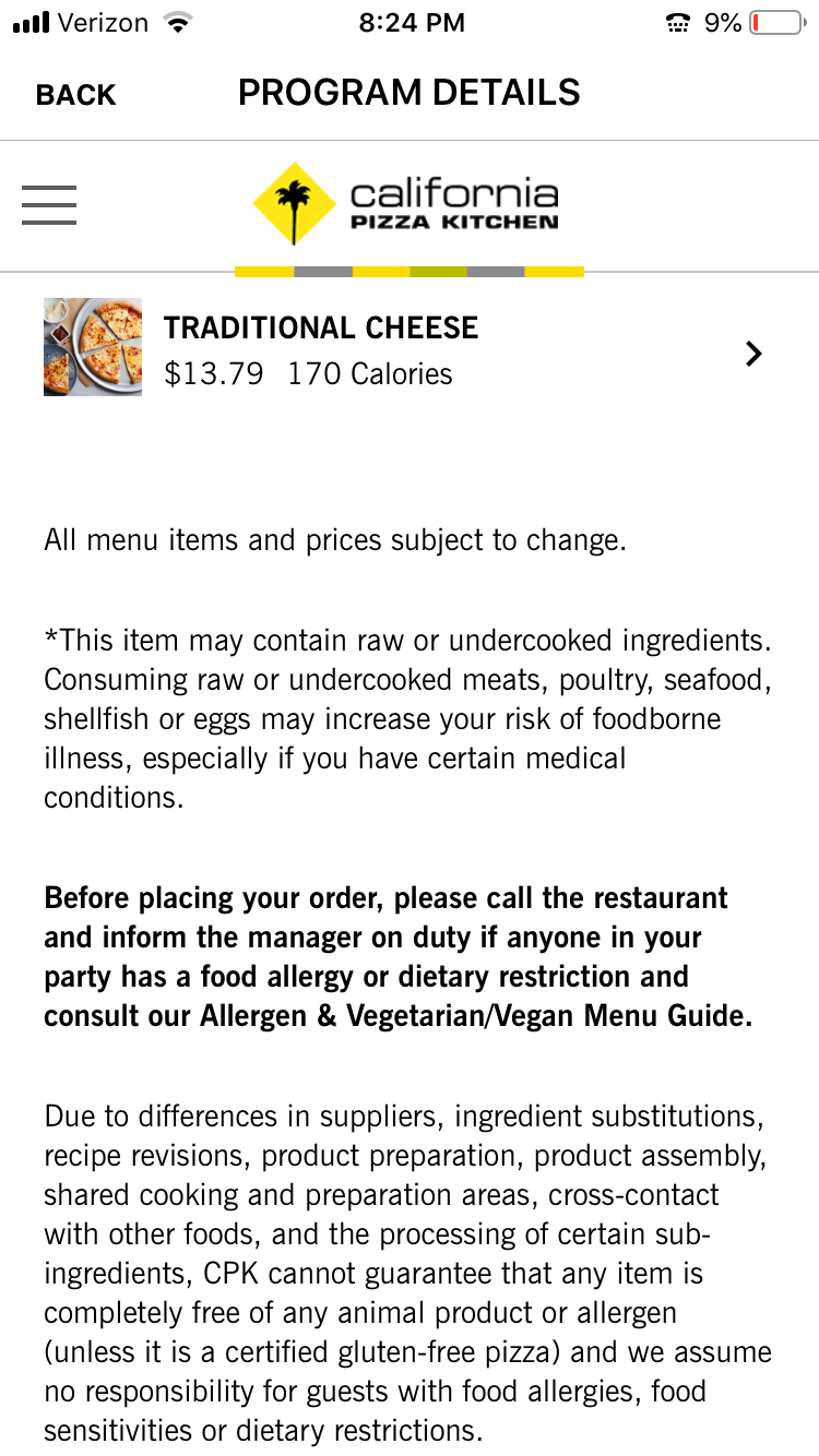
The project objective was to discover a popular app, highlight usability issues and make improvements. Before the redesign in 2019:
• The original apps primary functions are located in obscure places.
• The UI design is very plain with washed out colors and very thin, difficult to read text.
• Certain text elements are intended to be click-able but are unnoticeable.
• The rewards program sign up was painful
RESULT
I completely redesigned three major task flows in the CPK app improving functionality and visibility.
TOOLS
Research, Provisional personas, Storyboarding, AI, PS, InVision
ANALYSIS
CPK's LACK LUSTER APP
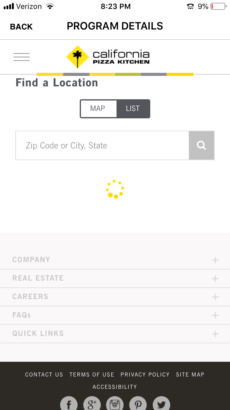
At first glance, I observed a plain app with washed out colors and very thin, difficult to read text. Call to action buttons are unnoticeable. The menu is scrollable, but not selectable. Map is slow and unresponsive. Sign in required to browse selections. All forms were labor intensive.
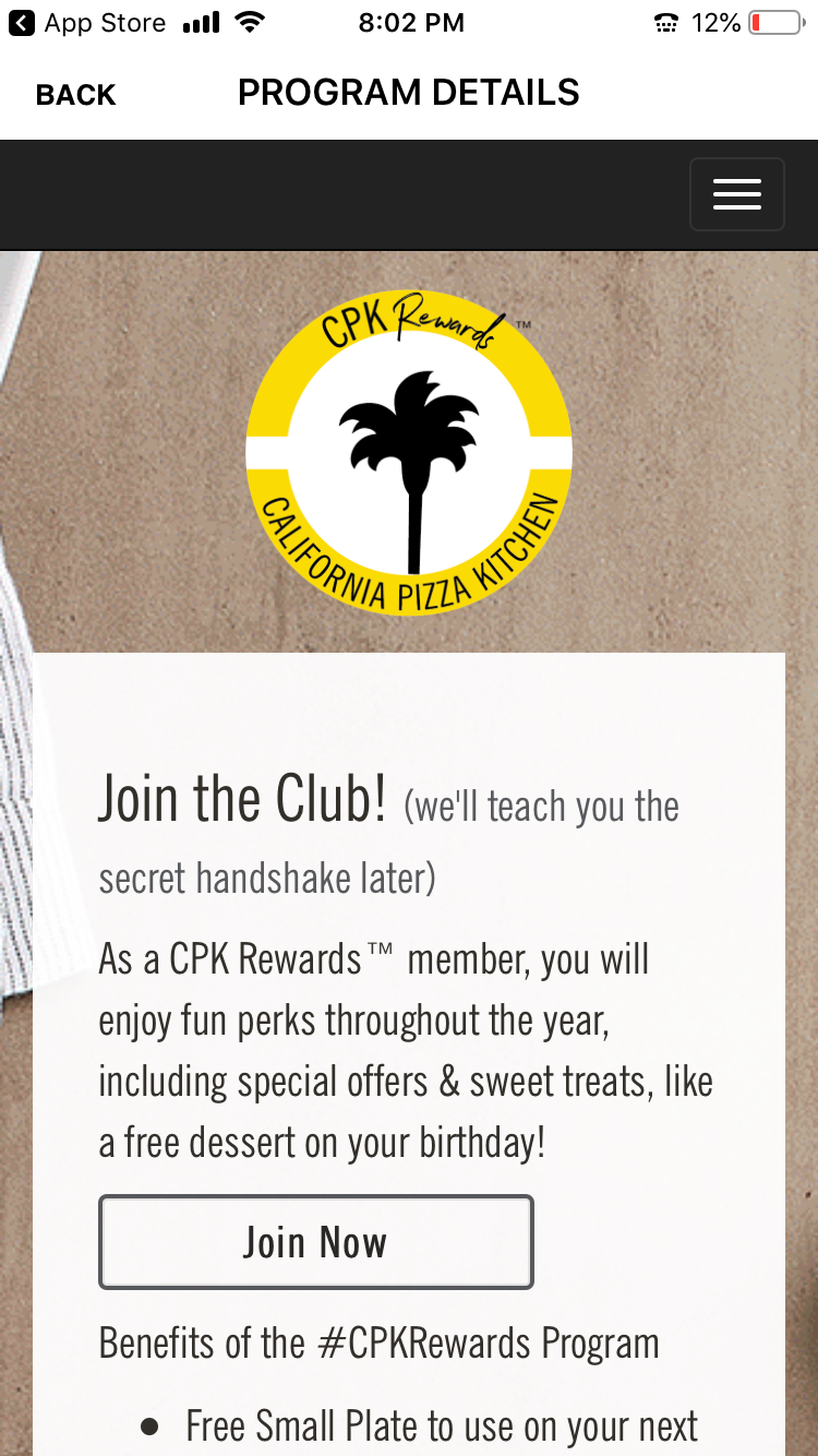
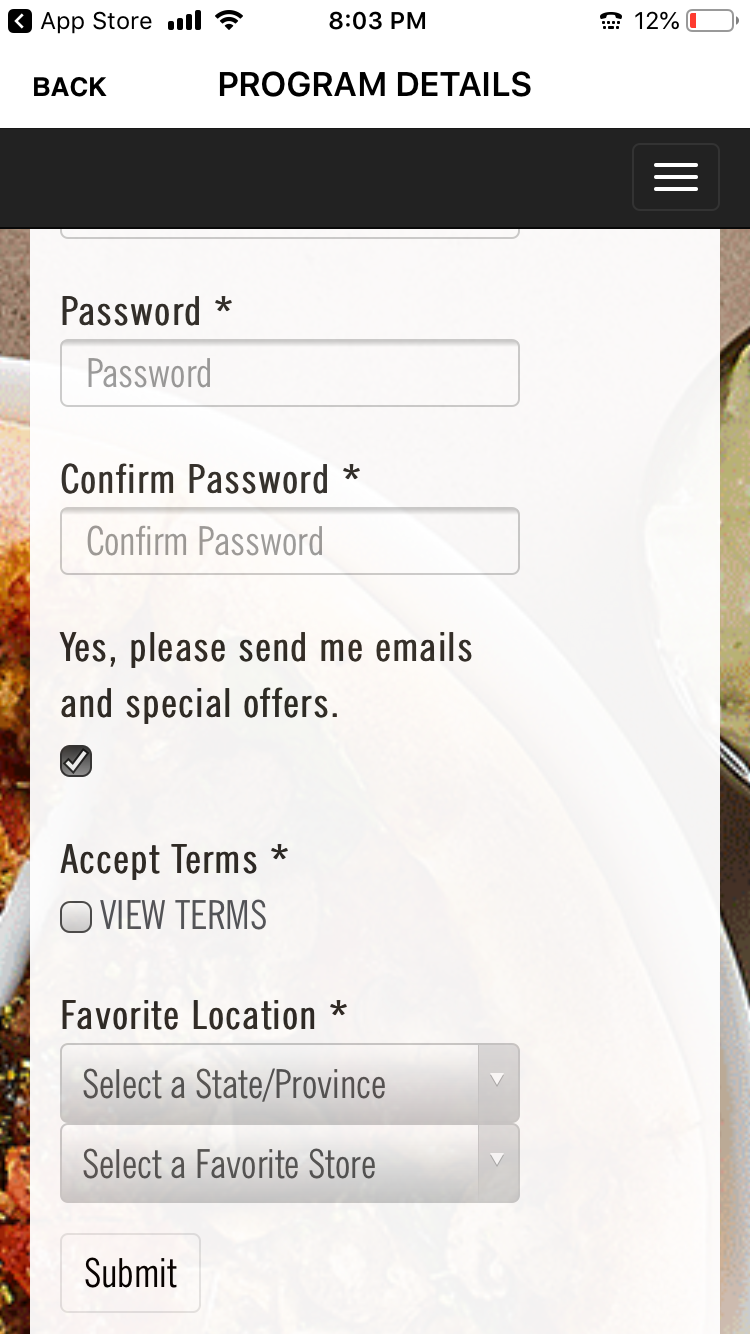
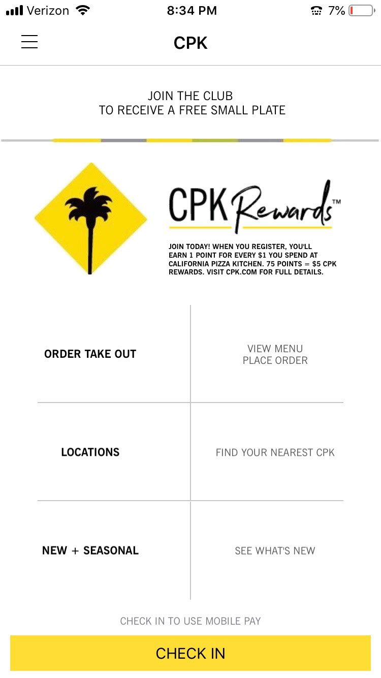
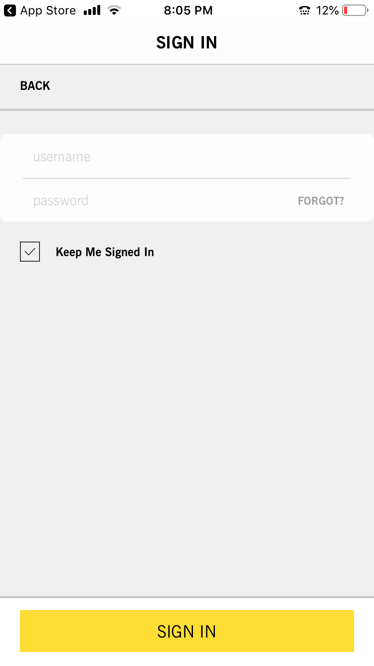
The CPK Pizza Dough Rewards program is a feature the restaurant chain advertises both in the restaurant and on the app. Unfortunately, there is no sense to be made of the lengthy sign up process and the menu strangely appears at all intervals. My goal was to uncover a users primary tasks before I tackled designing screens.
DISCOVERY
USER INTERVIEWS/Empathy maps
I wanted to get a better understanding of my users motivations to use the app. After several informal interviews and observational research at CPK restaurants, I created three personas of typical users and mapped their motivations and feelings.
What tasks are users trying to complete?
What questions do they need answered?
How is the user feeling about the experience?
What really matters to them?
What people, things or places may influence the user acts?
What pain points might the user be experiencing that they hope to overcome?
What is the users ultimate goal?
John is interested in CPK rewards
Tammy wants to check out CPK's Pizzas for lunch
Tom is browsing the app and wants to order food
STORYBOARDS
I quickly sketched three storyboards based on typical use cases.
WIREFRAMES
I created wireframes based on clear user flows which were inspired by my persona's goals. My design decisions reflected the user’s needs and emotions, keeping in mind CPK's business goals.
SCREENS
INVISION PROTOTYPES
TAKEAWAYS
This redesign was made before CPK updated their app and I see they have made improvements to their search and discovery. I was pleased with my designs overall and the task flow was improved based on user testing.
